Today, alas, is the 58th anniversary of Dashiell Hammett’s death. Hammett (May 27, 1894 – January 10, 1961) both helped originate and define the American noir and hard-boiled crime writing styles, but we don’t need to tell you that. Chances are, if you’re reading this post, you’ve already read a few of his books, and seen several film adaptations of his works. Red Harvest, in particular, has been the basis for four films, none of which have credited the book as their original source material; an accident of accreditation that has led to fewer movie tie-in covers than other works by Hammett with more firmly established book-to-film lineages (and thus better covers). Red Harvest is one of Hammett’s most political works, and since his imprisonment by the US government for refusing to name names exacerbated his lifelong struggle with tuberculosis to cause his untimely demise, it seemed only fitting to round up the best covers of Hammett’s classic in honor of his life and his struggles. And because we have yet to achieve egalitarianism in the world, we ranked them.

20: Australia, 2013: This one wins least disturbing, but also, most…confusing. What’s with the purple, Australia?

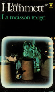
19. France, 1968: This edition from Gallimard was the most interesting French cover of Red Harvest we could find, which should give you an idea of how little work the French put into cover design. Try harder, France!

18. Spain, 1981: This pulpy edition from Barcelona-based genre publisher Editorial Bruguera goes full Chicago gangster for its inspirations.

17. Spain, 2013: This recent edition from publisher Alianza Editorial goes 1920s (we assume in honor of the novel’s origins), featuring elements of collage, strong red and black color contrast, and a small human figure ready to go up against forces much larger than himself. Competent, but sadly, less engaging than its inspirations.

16. Italy, 1975: At a time when American cover designs were getting increasingly stripped down to their minimalist cores, this cover from Milanese publisher Longanesi is still pulp AF. The gaudy awards ribbon at the top seems to vouch for the quality of the writing, even as the scantily clad woman and her muscular rescuer promise entertainment up the wazoo.

15. Russia, 1992: This cover design, with its powerful female figure at the forefront, seems unique in the annals of Red Harvest cover designs. This one also gets bonus points for actually relating to the plot, rather than recycling the iconography of pulp.

14. USA, 1972: this pared-down edition from Vintage books has a clear message: this book will be violent. Like, really violent. That’s why there are so many bullets on the cover. If it was less violent, there would be fewer bullets on the cover. Got it? Good.

13. UK, 1975: Unlike the Italians, the Brits decided to update the fashion when this paperback was designed for Pan in the mid-70s. Don’t worry, however—true to pulp form, the regal woman on the cover is still flashing a bit of leg, and there’s a Victrola behind her to remind us the book is, well, not from the 70s.

12. USA, 1968: We might consider this design a bit exploitative, except for the words “violent masterpiece” blazoned across the top, which, combined with the photo of a man standing over a dead woman, almost seems to function as a trigger warning for the level of brutality contained within. Good job telling us what to expect, Dell Paperbacks!

11. USA, 1963: Romek Marber’s cover design for Penguin showcases the bold minimalism of mid-century design. Kudos to Marber for not putting a sexy lady on the cover.

10. Russia, 1989: This minimalist edition seems to signal that Dashiell Hammett has arrived in the halls of what Russians consider literary detective fiction. Or the publisher was broke. Either way, we like it!

9. USA, 1929: Despite that terribly annoying hyphen in the middle of the title, we quite like the original cover design. There’s a strong minimalism to the design, yet the stars along the border speak to the violence and lush excesses of American culture. Or, they’re just there to look pretty.

8. Italy, 1994: We love the dynamism behind the deceptive simplicity of this Italian cover. Fun fact: giallo, while known to many Americans as a genre of Italian horror film bringing elements of suspense, horror, and crime together, and paving the way for American slasher films, originally referred to “yellow” genre fiction paperbacks published in post-fascist Italy. Ya learn something every day…

7. UK, 1975: The more I look at this cover from Pan Books, the more disturbed we are. Why is that screwdriver leaking blood? Is it…piercing…something? And why is such a normally soothing color scheme so alarming here?

6. England, 1958: This cover design by John Vernon for the first British edition of Red Harvest, published by Panther Books, brings a pulp sensibility to the hard-boiled classic.

5. USA, 1958: This edition from Perma Books, illustrated by Lou Marchetti, at first glance appears to be a typical pulp illustration. At second glance, the dead-eyed cynicism of the leading lady as she gazes upon a man in the process of falling apart is remarkable, and makes this the only cover on the list that attempts to represent the female perspective.

4. Italy, 1981: While most of the covers of Red Harvest focus on the more sympathetic characters, kudos to the Italians for getting at what this book is really all about: capitalists wearing white clothing and smoking cigars while looking mean.

3. USA, 1943: Wartime rationing may have effected the paper quality of this pocket paperback, but the publisher certainly didn’t sacrifice when it came to design. The iconography of an industrial building, held in a giant, bloody hand, is clear: this is a book about capitalism and it’s discontents, and there will be blood.

2. Spain, 1979: With its blood-drenched spare tire reminiscent of a staring, tortured eye, this one seems designed to evoke Bunuel, which really does seem perfect for 1970s Spain.

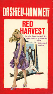
1. USA, 1961: A femme fatale in a debutante dress in the foreground, a corpse in the middle ground, and a shocked man in the doorway tell a whole story just on the cover alone, expertly illustrated by Harry Bennett. While this could easily fall into the category of pulp art, we’re impressed by the level of dynamism in the image, and the debutante with her head hanging low is an intriguing contrast to the traditional pulp representation of the female form.


