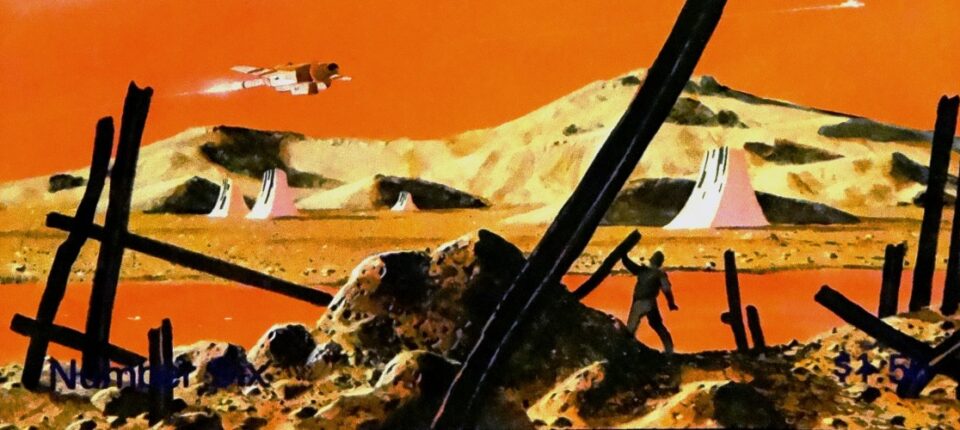
Coming of age in the 1970s I was an aficionado of all things visual: from comic books on newsstand racks to paintings on museum walls to paperback covers on the shelves of my favorite bookstores. Gazing at the beautifully painted covers in the science fiction and fantasy sections, it wasn’t long before I became a fan of various cover artists including Frank Frazetta, Leo & Diane Dillon, Jeff Jones and numerous others. Though considered commercial art, many of the illustrators were as visionary as Pablo Picasso or Salvador Dalí, and deserved to be taken seriously.
Decades later I stumbled across the wonderful site 70s Sci-Fi Art, a Tumblr curated by writer Adam Rowe that transported me back to those years of discovering brave new illustration styles. After years of spreading the images through his site and social media, Rowe has recently compiled the innovative book Worlds Beyond Time: Sci-Fi Art of the 70s (Abrams Books). In addition to the full-color reproductions, Rowe’s book contains interviews, critical evaluations and an introduction by legendary science fiction artist Vincent Di Fate. For fans of the genre, this tome offers the perfect yesteryear view of a speculative tomorrow.
Michael Gonzales: Although I’ve been a fan of science fiction art since I was teenager in the 1970s, I learned so much from your book. What was it about that era of science fiction and fantasy art that originally reeled you in?
Adam Rowe: There’s just something impossible to put my finger on about the art styles and subject matters that were popular at the time. The art always uses analog materials, but often feels sharp and sleek thanks to tools like airbrushes. And the imagination behind the subject matter is so refreshing: So many modern mainstream science fiction visuals in film or TV center on dull, militarized spaceships, as opposed to wild concepts like cities in bubbles or a crowd of humanoid cat aliens.
Plus, I’m a sucker for the bold color choices that defined sci-fi covers during this period. I just saw a Paul Lehr illustration of an orange planet with a purple ring yesterday and was simply in awe.
What were a few of your challenges in assembling this book? Were you able to reproduce from original paintings? Any artists who fell through the cracks?
In a lot of cases, the artists or their families were able to provide large, high quality scans of the original artworks. More than a few times, I was able to find original scans from Heritage Auctions, an auction house that uploads very nice scans of every artwork they auction off. Quite a few times I had to make do with book cover scans themselves, although I was able to pay a graphic designer to edit others.
Though you highlight the major sci-fi/fantasy magazines that featured these paintings, you also featured the little-known zine Galileo. I loved that publication; the first issue I bought was the one with the Jeffrey Catherine Jones wraparound painting. How did you discover it?
I had seen its covers on the internet for years, but once I tried learning a little more about it, I really thought Galileo had a better story behind it than the more well-known magazines like Analog or Asimov’s. It rose to prominence, bought out another well-known magazine Galaxy, and then overextended itself and folded, all within a handful of years in the late ‘70s. I wanted to explore what the world of science fiction magazines was like in the 1970s, and all the drama inherent to that rise and fall made Galileo the most intriguing entry point.
One artist I loved growing-up, but never knew his name until reading your book, was Dean Ellis. His burning city cover for Samuel R. Delany’s masterwork Dhalgren was one of the most iconic of that era. What artists did you discover while on this journey that you included in the book?
I had already been collecting art from almost all the artists on my Tumblr blog since 2013, but in the process of writing this, I developed a deeper appreciation for many artists. John Schoenherr is a big one; His eye for composition and naturalism is just stunning, so there’s a lot to absorb on any of his covers.
Getting to see hi-res scans of many artists brings out a lot of detail that can be harder to notice online, too: I remember really enjoying the tiny details that Angus McKie includes in his artworks. He loves to throw in whimsical plants and animals on an alien planet or random numbers and symbols on a space station.
Tell me about your relationship with Vincent Di Fate, a legendary artist who also wrote the book’s introduction. What was your pitch to get him involved? Did he give you any advice about putting the book together?
Fairly quickly after deciding to write a pitch for this book, I realized there was a great art collection that already covered a lot of the same ground: Di Fate’s Infinite Worlds, 1997. It covers over a century of science fiction art, so it’s not the exact subject as mine, but I highly recommend it to anyone who enjoyed my collection.
I also talked to Grady Hendrix, an author who co-wrote the 70s and 80s horror fiction celebration Paperbacks From Hell in 2017 (a big inspiration for the format and tone of Worlds Beyond Time). Hendrix told me that talking to Di Fate had helped him understand the publishing industry better, and recommended I talk to him for my book.
I interviewed Di Fate a few times while writing the book, and his knowledge of science fiction art history was immensely helpful – I learned a lot. He told me about one of the most interesting shifts in ‘70s science fiction cover art history, the fact that cover art trends shifted away from surrealism and towards representational art in 1971, when two influential editors led the charge: Donald A. Wollheim left Ace Books to start DAW Books in 1971, the same year Lester and Judy-Lynn del Rey started the Del Rey imprint within Ballantine.
So, when I was looking for someone to write the foreword, Di Fate was my first choice. I’m thankful he agreed!
Growing-up I was a big fan of writer Harlan Ellison, who for most of that decade used Leo and Diane Dillon to illustrate his covers; did other writers have similar relationships with their cover artists? Were writers able to choose who visualized their work?
It varied a lot, but well-known authors definitely were able to at least recommend the artists they preferred. Frank Herbert loved John Shoenherr’s work for Dune and would work with him whenever possible, for instance.
I believe publishers were the orchestrators for the more well known author-artist team-ups. This is because using the same artist for the same author establishes a visual continuity that helps the audience know what to expect. A few that come to mind are the Dean Ellis covers of Ray Bradbury titles for Bantam Books in the 1960s, and Frank Frazetta’s 1967 reprint covers for the Robert E. Howard’s Conan series (the latter of which helped to launch fantasy as a paperback genre).
Within the world of illustration science fiction covers paid the least, but many of the artists worked in the genre for decades. What do you think were their motivations?
Love of the game! Frank R Paul is an influential pulp artist who worked from the 1920s to the 1960s, but worked his day job in architectural design the whole time. It’s pretty clear he just loved the imaginative genre. And many of these artists are big science fiction fans, showing up at conventions and doing fan art in their spare time.
Incidentally, I don’t think the prices have improved much over the years, and opportunities may have dried up. Paul has said that he wasn’t paid much in “the early days,” just $50 for a cover, but if you adjust that for inflation, it’s about $800, which is the highest that DC or Marvel tend to pay for a cover (at least according to a 2017 survey).
We can clearly see the changes in art styles from the 1950s to the 1970s, but have there been any drastic leaps since then? Is new millennium art that much different from 40 years ago?
I think the biggest change since the push for representational art in 1971 was the steady adaptation of digital tools over the 1990s. Book covers are ultimately about marketing, and so they have to stay fresh. Once digital art was the new way to do things, the industry started to shift away from the science fiction art styles that had defined the 1970s and 1980s. The publishing industry began consolidating around that decade as well, and so they
I really enjoyed the “Star Wars Before Star Wars” section, because it showed how much George Lucas, and filmmakers in general, were inspired by these artists. What were some of your other art to film (or television) swipes you discovered?
Marvel has leaned into the 70s sci-fi aesthetic for their cosmic space movies. Thor: Ragnarok even had actual Jack Kirby art as wallpaper in some scenes, along with very Chris Foss looking spaceship designs, and Foss was hired to work on Guardians of the Galaxy as well. And the new Dune movies have more than a few shots that seem inspired by John Schoenherr’s illustrations, although I have not confirmed that. Probably the biggest influence is in video games – many of the imaginative artists today who would have done covers in the 70s are concept artists for video games.
Are there any other art book subjects you’d like to tackle?
Definitely! There are plenty of individual artists who deserve their own collections – Paul Lehr, John Schoenherr, and Dean Ellis are all on that list. But I also love plenty of related-but-different art eras. The ’60s pulp art of men’s adventure magazines is full of Nazis and sharks getting punched in their faces; the retro computer art of the ’80s and ’90s had an odd fascination with fantasy tropes.
And I’m continuing to document plenty of 70s sci-fi art history on my email newsletter, so I might have the material I need to do a second volume of Worlds Behind Time if the opportunity ever opens up.
–Featured image: from Ron Miller’s cover art
for Galileo Magazine January 1978

