By the end of World War II, it was obvious that pulp fiction magazines—which had served for a couple of decades as fecund breeding grounds for crime and mystery writers—were on the wane. Publishers of new-style paperbacks moved in quickly to gobble up those periodicals’ market share, rolling out reprints and, later, original works.
A number of authors who’d made their bones penning short, punchy stories for the rough-paper monthlies (Raymond Chandler, Cornell Woolrich, David Goodis, and Erle Stanley Gardner among them) successfully made the leap into paperback publication, as did many pulp-practiced artists. The switch by readers to longer stories and slightly higher-quality paperbacks was really less a revolution than an evolution. “Most Americans [of the postwar era] had been raised on a steady diet of reading pulps, so there was still a strong cultural appetite for popular fiction,” explains painter and pulp-art authority David Saunders in an essay for Ed Hulse’s outstanding 2021 study, The Art of Pulp Fiction, “but the handy format of a pocket-sized book was more appealing to the newsstand public than an old familiar pulp magazine.”
While some publishing imprints were initially reluctant to embrace the lurid, salaciously intriguing artistry associated with pulp mags for their new, economically priced but marginally more upmarket softback books, others—notably those claiming extensive crime fiction lines—were quick to adopt front-cover formulas scarcely more complicated than sexy woman + rumpled tough guy + gun = potential best-seller. Garishly depicted action scenes, bold, hand-lettered titles, and lithe lovelies—in trouble or in control, but above all, indiscreet—predominated. The mid-20th-century paperback fiction boom “was essentially a marketing exercise in selling books by exploiting the female,” observes Colin Larkin in Cover Me, his 2020 history of British publisher Pan Books. “The Brylcreemed, chisel-featured male of their cover art was nowhere near as visually powerful as the sexy and carelessly-dressed female.”
Commercial artists were called upon to toil at speed, and usually for rock-bottom remunerations, to meet that era’s escalating demand for paperback-cover illustrations. The most talented of the bunch produced work that’s still cherished by collectors. Yet the pace they maintained in order to make ends meet, coupled with pressures to chase aesthetic trends thought to be especially saleable, led to recognizable—and occasionally eccentric—themes cropping up in their artwork. In the same way that aerial photographs of snow-shrouded forests, central figures captured from behind, and sinister children’s playgrounds have all become clichés on the jackets of modern crime, mystery, and thriller novels, so too were images of women exposing themselves to men, corpses in bathtubs, and damsels reclined—and plainly deceased—on bedsheets overly recurrent fixtures of mid-1900s paperback fronts.
Those, however, weren’t the only motifs once pervasive in this genre. Let us venture now into the deeper, dustier recesses of crime fiction’s past, where oversized pates loomed behind every shoulder, bodies had a nasty habit of tumbling from the sky, malicious mitts demanded the spotlight, and shapely shanks got all the attention they deserved.
___________________________________
THREATENING VEHICLES
___________________________________
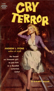
Automobiles have represented risks to mankind at least since 1899, when a real-estate dealer named Henry H. Bliss was struck in New York City by an electric-powered taxicab as he helped a female companion alight from a trolley car, ensuring his place in history as “the first recorded motor vehicle fatality in the United States” (to quote from a plaque that now identifies the accident site). Trains have been marked as threats to life and limb even longer, dating back to the 1810s. No wonder recklessly speeding conveyances were regular fare on pulp mags, and resurfaced again on paperback fronts.
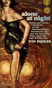
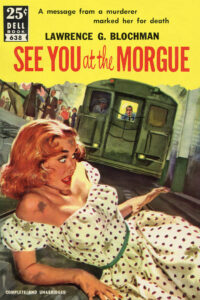
Choice among the variety displayed above is Harry Bennett’s dramatic cover for the 1963 Gold Medal Books original Alone at Night, by Vin Packer (aka Marijane Meaker), the story of a recently paroled convict and some fresh questions raised in regard to the long-ago vehicular homicide that sent him to the slammer. No less sensational is the impending subway tragedy Mike Ludlow portrayed on See You at the Morgue (Dell, 1952), author Laurence G. Blochman’s rather breezy mystery involving a homesick biochemist, his career-minded girlfriend, the manufacturing of glass eyes for stuffed ducks, and a New York City police detective baffled by the corpse of a handsome gigolo.
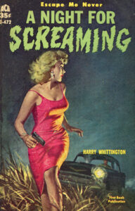
My editor will object if I take space enough to comment on every paperback wrapper arrayed the length of this page. But I cannot fail to also highlight the rather famous painting Robert Maguire contributed to A Night for Screaming (Ace, 1960), a tension-gorged Harry Whittington yarn that finds a rookie cop—on the run from a bogus murder charge—hiding out at a sprawling Kansas farmstead described by one reviewer as “half volunteer, half county prison.” Finally, Robert Schulz evoked early damsel-in-distress-style film serials with his artwork for F.O.B. Murder (Permabooks, 1956), the first of five railway-backdropped procedurals Dolores Hitchens concocted with her second husband, Hubert Allen “Bert” Hitchens, a railroad investigating officer. By the way, “F.O.B.” stands for “Freight on Board,” a phrase bound to rouse the avarice of any purloiner looking for a big score—in this case, a trove of diamonds.
___________________________________
GIANT HEADS
___________________________________
When the massive floating noggin of a woman was spotted last summer above popular Yoyogi Park, in Tokyo, Japan, it both piqued the interest of commuters and caused them consternation. That colossus was eventually found to be nothing more baleful than a balloon, contrived by artists and raised to coincide with the 2021 Tokyo Summer Olympics. But it reminded me of how common hovering heads once were on softcover crime fiction.
A case in point: the sadly unattributed illustration introducing Pan Books’ 1960 release of One of Those Things, a standalone thriller by British hard-boiled fictionist Peter Cheyney. There’s something more than a wee bit ominous about this cover’s cigarette-sucking male—presumably the book’s protagonist, Irish private investigator Terence O’Day—peering over the begloved lady’s clavicle. Whether it’s scorn (as the cover line suggests) or lechery in his eyes is difficult to discern, but he certainly doesn’t look like somebody you should feel comfortable turning your back on. By the way, this publisher’s Great Pan line boasted more than its fair share of giant-head fronts.
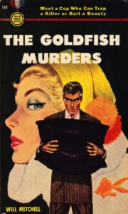
Meanwhile, for Will Mitchell’s The Goldfish Murders (Gold Medal, 1950), Budapest-born American illustrator Frederic Varady (known best for his contributions to Cosmopolitan, Good Housekeeping, and other glossies) presents the beauteous blonde noodle of a showgirl, one of many such performers populating this not-altogether-serious tale built around New York City’s entertainment industry, the funeral business, and a killer whose calling card is—you guessed it!—goldfish. The pillow-plumping gent in the foreground could be the slayer, or maybe it’s police homicide detective Christopher Lash, tasked with bringing the curtain down on that Broadway killing spree. And get a load of the terrified-looking face on Death for Mr. Big (Gold Medal, 1961), a pulpy revenge thriller written by the prolific Robert Terrall under his “John Gonzales” pseudonym. The belle seated upfront came from Barye Phillips’ easel, but the mug behind was actually borrowed from a decade-older version of this book, its artist not identified.
___________________________________
LEGS, LEGS, AND MORE LEGS
___________________________________
Celebrated paperback artist Mitchell Hooks once told an interviewer that, at the apex of the paperback boom, “absolutely every book had to have a sexy cover. It didn’t matter what the book was, it could have been a cook book. It had to have a woman on the cover with prominent bosoms.” Which isn’t to suggest that other feminine body parts would not suffice in a pinch. Indeed, legs—the longer and shapelier the better—featured almost as ubiquitously on vintage crime-fiction novels as did their busts.
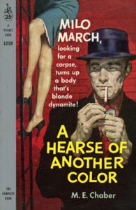
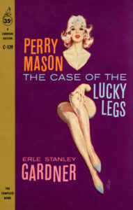
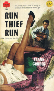
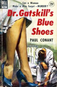
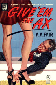
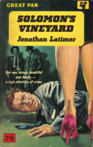
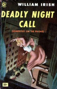
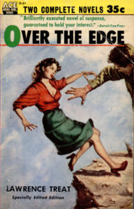
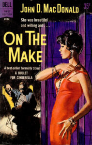
It’s not going out on a limb to say that Robert McGinnis is the genius of graceful gams. Over his more than six decades of painting book covers, McGinnis has emphasized, more and more, the nether appendages of his fairer-sex subjects, frequently distorting them for maximum visual impact. Note, for instance, the aloof blonde he drew for Fawcett’s 1965 edition of Take a Murder, Darling, one of Richard S. Prather’s novels starring Hollywood shamus Shell Scott: she’d appear to be perched on stilts were she standing rather than warming an office chair. Seemingly more realistic is the high-heeled, pencil-skirted knockout James Meese pictured descending a building’s emergency escape ladder on the 1959 Pocket release, A Hearse of Another Color, the eighth entry in a series by M.E. Chaber (Kendell Foster Crossen), headlined by well-traveled insurance investigator Milo March. And while nylon stockings weren’t always showcased on these older fronts, when they were, it was chiefly the full-fashioned variety with seams sprinting up the back (much in demand until the 1960s), their wearers witnessing either the onset or the aftermath of violence—as you’ll notice on British illustrator Sam Peffer’s art for Solomon’s Vineyard (Great Pan, 1961), by Jonathan Latimer, and the two other final covers comprising this set.
___________________________________
FALLING BODIES
___________________________________
Acrophobics might do well to skip past this next section, as we’ll be examining vertiginous covers enthralling enough to make one’s head spin. Like menacing motorcars and trains of all sorts, people plummeting from lofty heights—those who’ve been pushed to their deaths, or who have stumbled disastrously—once constituted a run-of-the-mill pulp-art trope, soon transferred to paperbacks. As authors and artists both knew, fear sells.
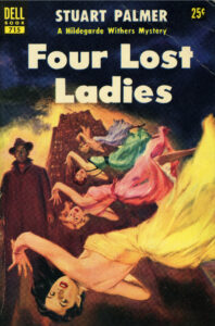
Consider, for example, Rudolph Belarski’s rendering of a lightly clad and ill-fated aerialist for About the Murder of a Circus Queen (Popular Library, 1948), one of eight mysteries starring New York City Police Commissioner Thatcher Colt, all conceived by Anthony Abbot (the pen name of journalist/author Charles Fulton Oursler). British fictionist Martin Edwards, an authority on Golden Age detective stories, calls this yarn—about a slaying committed before thousands of big-top spectators—“vivid and atmospheric,” and notes that soon after its original publication, it was turned into a movie called The Circus Queen Murder, starring Adolphe Menjou. Equally guaranteed to make your breath catch is the 1960 Four Square paperback The Big One Got Away, by Robert Standish (aka Digby George Gerahty). Its imagery is by Roy Carnon, who labored primarily in advertising, but also created artwork for Edgar Rice Burroughs’ science-fiction novels.
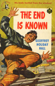
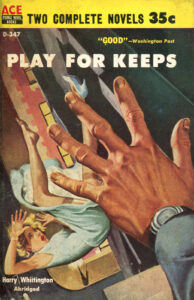
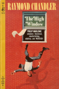
There’s no mystery about what sort of end is in store for the man seen on Geoffrey Holiday Hall’s The End Is Known (Pocket, 1951). Paul Kresse’s illustration draws directly from this story’s intriguing setup: As a department store vice-president, Bayard Paulton, returns home one evening, he barely escapes being flattened by a guy plunging from an upper-level window. It turns out the apartment that man came from was Paulton’s own—though the V.P. doesn’t know him from Adam. Last but not least, we have the fabulous, if uncredited front of Play for Keeps (Ace, 1959). Harry Whittington’s hard-edged account of a lawyer framed for offing his wife bears what may be the most underwhelming critical recommendation ever to adorn a crime novel: “Good!” proclaimed The Washington Post.
___________________________________
DISEMBODIED HANDS
___________________________________
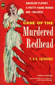
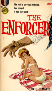
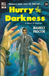
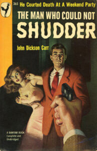
Play for Keeps reminds me of another perennial design theme of mid-20th-century crime and mystery paperbacks: human hands seen reaching into the foreground of their covers, the owners of said paws otherwise unrevealed. Those hands were typically terrifying, generally male, and inevitably striking. They seemed to come out of nowhere—grasping, choking, imploring, pushing, and all too frequently wrapped around weapons of one sort of another.
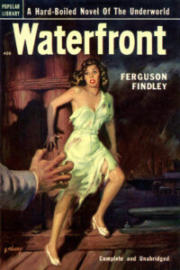
Case in point: The 1952 Popular Library edition of Waterfront, a gruff, gritty slice of noir cooked up by Ferguson Findley (né Charles Weiser Frey), and adapted by Hollywood as The Mob (1951), starring Broderick Crawford. For this tale about a rookie cop pursuing the boss of a racket that controls the New York City docks, Sam Cherry, one of the postwar era’s hardest-working pulp artists, painted a disheveled young woman in manifest fear for her existence, struggling to escape the clutches of a killer. The same species of terror that fills her eyes is evident, as well, in the provocatively robed beauty on Case of the Murdered Redhead (Avon, 1958), the opening installment in Francis and Richard Lockridge’s series featuring sad-sack Manhattan police detective Nathan Shapiro. We can only hope her attacker will be caught red-handed!
Ernest Chiriacka’s scene of a bikini-wrapped blonde and a man’s arm raised with seemingly nefarious intent was obviously inspired by the fact that one of Ovid Demaris’ principal characters in The Enforcer (Gold Medal, 1960) is a coldhearted leg-breaker for the mob in Los Angeles. However, there’s less ferocity in these pages than there is fornication, as the other main player—a cop embedded in the hood’s apartment complex—spends his undercover hours under the covers with one fetching neighbor after the next. Distinctive among the fists-pointing-guns covers gathered above is that of The Man Who Could Not Shudder (Bantam, 1949), one of John Dickson Carr’s well-known impossible-crime mysteries, set at a stately but allegedly haunted residence to which prospective ghost-debunkers have been invited for the weekend. Is it chivalry that causes the gentleman in Gilbert Fullington’s painting to stand his ground, while his female companion logically cowers from flying bullets? Or has he decided at last that he’d rather perish than spend one more nanosecond with the other party guests?
Lastly, one can’t help but wonder, in regard to Lu Kimmel’s artwork for The Corpse with Sticky Fingers (Berkley, 1957), what King Kong’s hand is doing on the cover of this Inspector Schmidt novel by George Bagby (alias Aaron Marc Stein).
___________________________________
BUTTERFLY CHAIRS
___________________________________
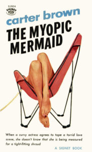
When I was a boy, I found inordinate delight in watching adults struggle to rise from the butterfly chair in a friend’s family room. With its black, tubular metal frame and large leather sling seat suspended from the frame’s uppermost corners, that capacious piece of furniture was as comfortable to recline in as a hammock, yet as awkward to exit as the later-voguish beanbag. Designed in 1938 by an Argentinean architecture firm, the butterfly chair quickly attracted international approbation and awards—as well as the curiosity of mid-1900s paperback cover illustrators.
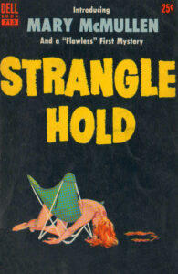
Victor Kalin’s front for The Living End, a 1957 Dell standalone yarn by Frank Kane (best remembered for inventing New York City P.I. Johnny Liddell), is a prime specimen of the breed, at once exuding sex, death, and hip style. Harry Barton’s “good girl art” for the 1964 Gold Star version of Cold Dead Coed, one of numerous Hank Janson thrillers, and particularly Spanish illustrator Manfred Sommer’s cover for Murder on Ice, a 1973 Ensign Books release by Michael Bardsley (Anthony Nuttall), offer playful tributes to this seat’s modernist roots in the way they twist a minimalist ideal, emphasizing female form over function.
___________________________________
BRASS BEDS
___________________________________
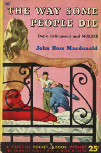
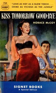
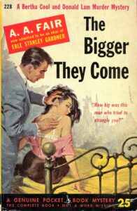
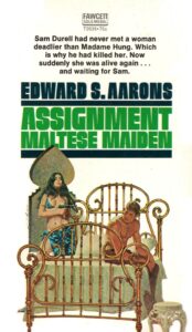
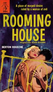
Metal bedsteads, shaped from brass or a combination of brass and iron, are said to have come into vogue in mid-19th-century England. They were touted at the time as more hygienic than traditional four-poster wooden beds, which tended to harbor woodworms, bedbugs, and ticks. While I’ve always thought of shiny brass beds as rather fancy, romantic furnishings, Art Scott, co-author of the 2014 book The Art of Robert E. McGinnis, says that was far from how they were depicted on classic paperbacks. “More than anything,” he explains, “[those beds] seem to be a universal symbolic indicator for ‘cheap rooming house.’”
That certainly jibes with the dozen covers exhibited here. The bare woman’s legs, discarded man’s necktie, and pull-down shade on Canadian artist James Hill’s painting for Grounds for Murder, by John Appleby (Dell, 1958), broadly intimates an afternoon assignation of the sort that goads this novel’s habitually considerate protagonist to do away with a younger British army major who has supposedly been cuckolding him whilst he’s away in Africa laying roads. Not an iota less suggestive is Owen Kampen’s illustration for Les Scott’s The Girl in the Black Chemise (Beacon, 1958), about “a woman of the twilight” who’s set on wresting her biddable inamorato from his “irresistible ex-wife.” Two of my other favorites: Mitchell Hooks’ portentous front for The Wench Is Dead (Bantam, 1957), by Fredric Brown; and the intimate scene Maurice Thomas limns on Pocket’s 1952 edition of The Bigger They Come (1952), the first of Erle Stanley Gardner’s books starring entertainingly mismatched Los Angeles gumshoes Bertha Cool and Donald Lam, published under the nom de plume A.A. Fair.
* * *
Although the events and elements of society flaunted on crime fiction paperbacks of the 1940s, ’50s, and ’60s could be coarse and ugly—fraught with lust and sadism, greed and paranoia, slow-boiling alarm and quick-firing mayhem—the art itself was often captivating. Publishers understood that, no matter the merits of any stories contained within, the covers were what initially inspired readers to pick up books. So they hired the most imaginative and hard-working illustrators their budgets could accommodate, sought to ensure faithful reproductions of finished paintings, and frequently applied spray finishes to give their products a shiny, pleasant texture.
And if there were thematic similarities between many of their softcover fronts? Well, that was not of great consequence at the time—merely something for future critics to recognize and over which they might nitpick at length.


