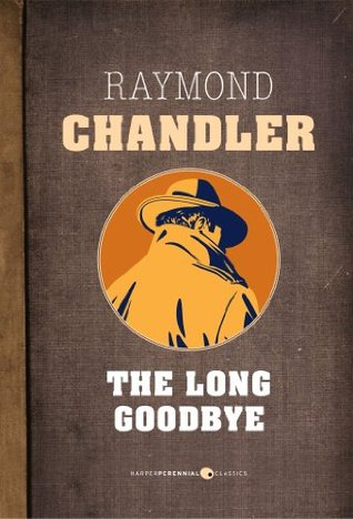
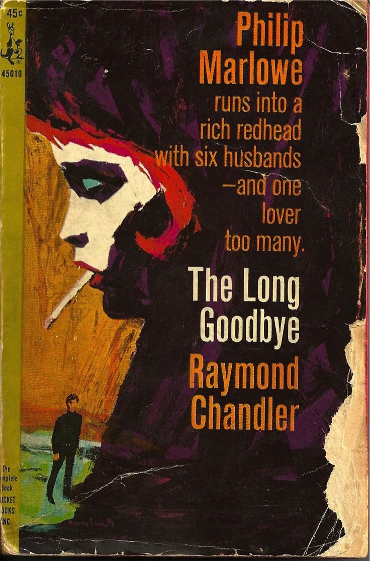
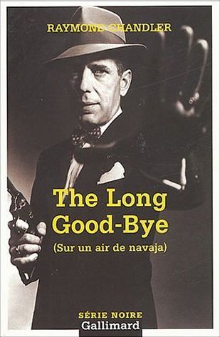
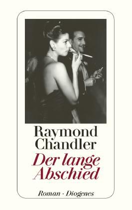
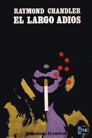
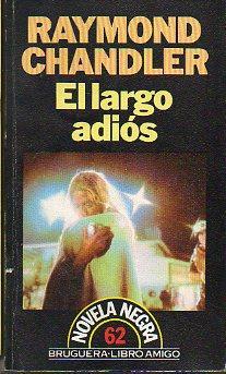
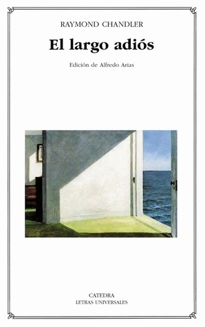
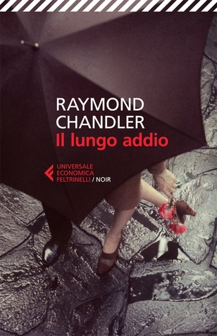
Simply saying Raymond Chandler’s name summons up a world: a slant of light, a wry grin, the sting of gin and lime, a melancholy something in the air. Few authors can match him for evocative intensity. Maybe that’s why we have so many iconic images from his work and such a strong visual sense of what it means to experience a Chandler story. The particulars range across individuals, ages, and cultures. The Long Goodbye alone—to many his greatest achievement—has inspired countless visions from artists and designers. There’s the Robert Altman film, of course, but then there are the hundreds of editions produced around the world, each with its own peculiar take on Marlowe’s Lennox/Wade investigations. Some are beautiful, some bizarre; often they’re both. On the 59th anniversary of Chandler’s death, here are 47 of the best covers of The Long Goodbye from around the world. They’re organized by language (almost certainly some are placed in the wrong section—my apologies), and chit-chat has been favored over rigorous analysis of aesthetics. Better, I think, to embrace the chaos. This is, after all, The Long Goodbye.
ENGLISH
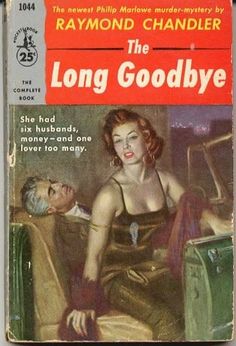
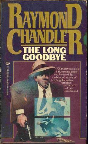
The English-language paperbacks have always made a strong showing for Chandler. Notice the contrast in blurbs, while you’re admiring: one salacious (“one lover too many”) and one from a rival, Ross Macdonald (“Chandler wrote like a slumming angel”).
Normally I’d eschew movie tie-ins, but (1) that rule doesn’t apply to Elliot Gould, and (2) this edition from Ballantine, a steal at just under a dollar, belongs framed and hanging on a wall.
Here’s another paperback gem from Ballantine.
Black Lizard produced a sleek, cool modern classic with its red-band Rolls.
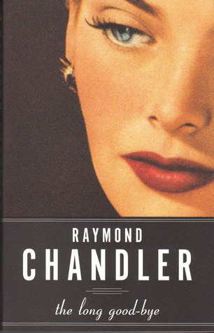
Harper’s 2013 edition is chic, with a new variation on an old standby: the eye.
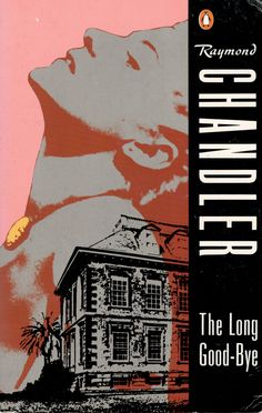
This cocktail pop art from Penguin, you’ll notice, had an influence in foreign lands. And that wasn’t the publisher’s only hit. A classic black band against sunset pink leaves a mark, too. The use of “Nighthawks” is a little questionable, but still a great image.
Harper Perennial went classy and cool, and it paid off.
My own personal favorite from the English language paperbacks is the 1962 Pocket edition, with cover art by the great Harry Bennett.
And of course, the iconic first editions. First the American, published in 1954 by Houghton Mifflin. Just the right balance of alluring, absurdist, hardboiled, hallucinatory, and beautiful.
And then the true first, the British edition. (The Long Goodbye was actually first released in the UK, by Hamish Hamilton, in November 1953, about four months ahead of the US release in 1954.) I think of this one as midcentury California sleaze, seen by Gaugin.
FRENCH
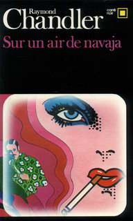
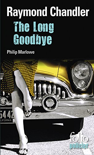
French edition covers of The Long Goodbye (no surprise) tend to focus on various portions of the female anatomy. Kudos to the Folio edition that zeroes in on the famous Rolls that opens the novel: “The first time I laid eyes on Terry Lennox he was drunk in a Rolls-Royce Silver Wraith outside the terrace of The Dancers.” Hard to beat the Carré Noir edition, though. Those trippy 60s color streaks, that eye, and that evocative title: “Sur un air de navaja.”
Article continues after advertisement

And then there’s the Série noire, featuring (against all odds) Bogart’s Marlowe.
GERMAN
The German editions have a Weimar tinge: cocktail party meets official injustice. Chandler spent some time in Germany as a young man, then later in life joined up with the Canadian army (B.C. unit) to fight the Germans in WWI. So, you know, it was a complicated relationship.
PORTUGUESE
First question re: below. Is that the same model from the French cover? Probably not, right? Second, I love the use of imenso in the title. That is, in fact, the real girth of this goodbye. Third, is there any bigger variation within a linguistic group’s cover choices? The Lusophone world is vast and possessed of diverse tastes, after all. (I don’t know for sure which were published in Brazil.) You have the bikini’d woman, the horror movie eye, and the chamber room cocktail party paraphernalia. That’s actually a pretty tidy summary of the book’s action.
SPANISH
The Spanish selection contains my own personal favorite, the lowball glass with the palm tree swizzle stick set against that vibrant blue. Well done, Debolsillo. The spilled flask isn’t bad, either, and how about that neon clown woman with her collar up, eyes hidden, and up to no good stare? Overall, the Spanish editions seem to hone in on the book’s potable qualities: a reasonable choice. Marlowe’s soft spot for well-dressed drunkards is what begins this whole mess, after all.
ITALIAN
Italy offers another good showcase for the Rolls. If I’m being honest, though, these editions leave a little something to be desired. Given Il Boom and the hardboiled Italian tradition, you would expect a certain fetishistic appreciation for Chandler.
This Persian / Farsi edition does not disappoint, with an immaculate recreation of the classic detective’s desk, smoking fedora’d shamus, silhouettes through the blinds, and an ink stand, because sometimes a typewriter just isn’t enough. Good thing that desk has a decent blotter, too, because that looks like spilt blood.
DUTCH
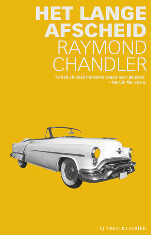
That’s one helluva sunburst color. The Rolls never popped quite so bright.
FINNISH
The Fins (I think, honestly not sure) are following the old time-tested axiom here, when in doubt, go with the shadow of a bird. The color scheme is astigmatic, but memorable.
BULGARIAN
A nice color palate is probably the strongest statement you can make on the Bulgarian representative. The man looks a bit bulky to be Marlowe, but that’s a fine line to draw.
POLISH
The Polish edition is another top contender. First, the color scheme is fantastic and captures something about midcentury Los Angeles perfectly. The storefronts may or may not be time and place appropriate, but they work and bring to life the scene where Marlowe finds Terry sleeping one off with a cop approaching, the second meeting that cements their bond. Bravo to the savvy designer. (Anyone with a copy, please hit me up immediately.)
Another very strong contender out of Eastern Europe. Look at that ashtray shaped like a piano resting on the edge of…a piano! I wouldn’t feel too comfortable with a fresh cocktail perched that precariously, and likely to leave ring stains on the wood, but hey, some people are gamblers. Marks for creativity on the telephone-heavy edition, too. A little reminiscent of Margaret Millar Beast in View covers/context, but they certainly work for The Long Goodbye, too.
(Probably goes without saying there are no classical Greek editions.) There’s a lot going on in the Greek editions, arguably too much. The second offering, focused on the eye, is rather elegant, with that bone white background evoking the infamous Lennox suitcase.
Honestly, I have no idea what this is, but I like that burnt orange sherbet color, and a part of me says, “those are ice cubes,” which feels right, but then I can’t bring it into focus…sort of like the plot to The Long Goodbye? No, that’s too much of a stretch.
I like to pretend Milan Kundera translated this himself and took liberties with the text. The money roll is an under-appreciated accessory, in my opinion. A good detective like Marlowe has plenty of five-spots to hand out. Would he use a rubber band? And would it be this fat? I guess that’s a dollar bill on the outside, but still, something a little more discreet might be wise.
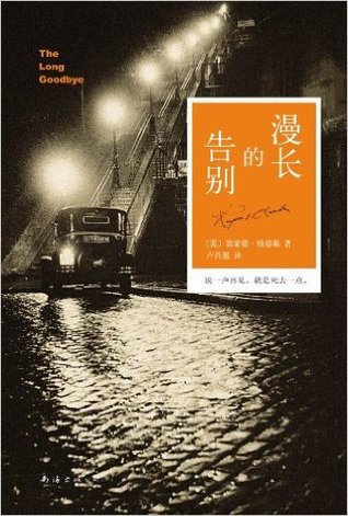
(I apologize for not knowing the exact origins here, or whether the editions are Mandarin or Cantonese.) I will say I particularly like the smoky, foggy atmosphere in the Chinese editions. The first has an abstract, obscure approach, and on the second, I believe those are the western stairs up to the Sacré Coeur in Montmartre, or possibly a hilly area of Los Angeles that I’m unaware of. Either way, there’s a fog rolling in, and I wholeheartedly approve.
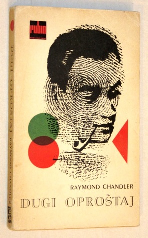
Another absolute top contender: the off-white background, the red and green lens shots overlapping, the profile done in the style of a fingerprint, a bull’s eye, or both. I would be proud to own this classy little paperback. Whatever that is he’s smoking, light me one, too.
THAI
One of the few covers based solely on patterns, and it certainly works. The black, the silver latticework, the gold embossing: all in all, an attractive rendition, though not a standout.
RUSSIAN
That’s either Terry headed to Marlowe’s with the suitcase, or Marlowe going to hide it. Why there’s a tree involved in that process, I’m not entirely sure, but I like it.
JAPANESE
Of course the Japanese go bold, almost Bond-style hallucinatory, but somehow just right for the strange swirl of loyalties and double-crosses that make up The Long Goodbye. You might need to wear shades to stare directly at that red and yellow scheme, but oh those pistols aimed at that tiny little man. That’s a nice piece of pop art for a pop classic.
NORWEGIAN
Our first cactus appearance, and none too soon, plus a nod to the western sun with that fringe glow around the central figures. This is a top 10 contender, without a doubt, and gets an extra bump knowing the influence Chandler had on the Norwegian crime writing scene.
Hungarian
Appropriate that the Hungarians would see Marlowe more as spy than sleuth. Or is that Terry? A nice depiction of the melancholy that runs underneath the ction of The Long Goodbye. The wisecracks are great and the action is second to none, but the pathos is the novel’s secret sauce.